Selected work
Tenoar / Matexsur
Real client project · Web Design · Textile manufacturing
Redesigning the digital presence of a textile manufacturing group.
- Role
- Web Design · Information Architecture · Content Strategy
- Duration
- 4–6 weeks
- Type
- Real website project
Visit Tenoar (opens in new tab)Visit Matexsur (opens in new tab)
01 / Overview
Two textile manufacturers whose websites told a smaller story than the business behind them.
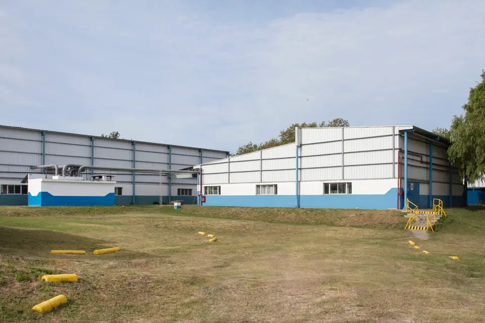
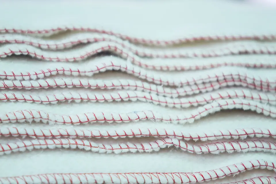
A web design and information architecture project focused on clarifying business communication, improving content structure and strengthening B2B credibility for Tenoar and Matexsur, two companies in the same textile manufacturing group. They serve B2B customers across retail, supermarket and industrial contexts.
- Since 1992
- Textile manufacturing background
- 80,000 m²
- Industrial facility context
- Private label
- Product development and manufacturing
A note on process: unlike FS.dk, a self-directed Product Design case study, this project was not based on formal user interviews. It was driven by business context, industry knowledge, information architecture and web design decisions.
02 / The challenge
The digital presence didn't match the operation behind it.
The starting point wasn't a missing feature. It was a credibility gap.
- Unclear positioning
- The sites did not communicate what made the group different from other manufacturers.
- Fragmented content
- Information was scattered across pages with overlapping topics and no clear hierarchy.
- Weak storytelling
- Manufacturing capability was buried under generic copy and stock visuals.
- Lack of differentiation
- Pages read like a default supplier site.
- Outdated presence
- The visual language no longer matched the maturity of the operation.
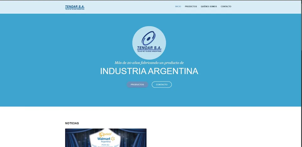
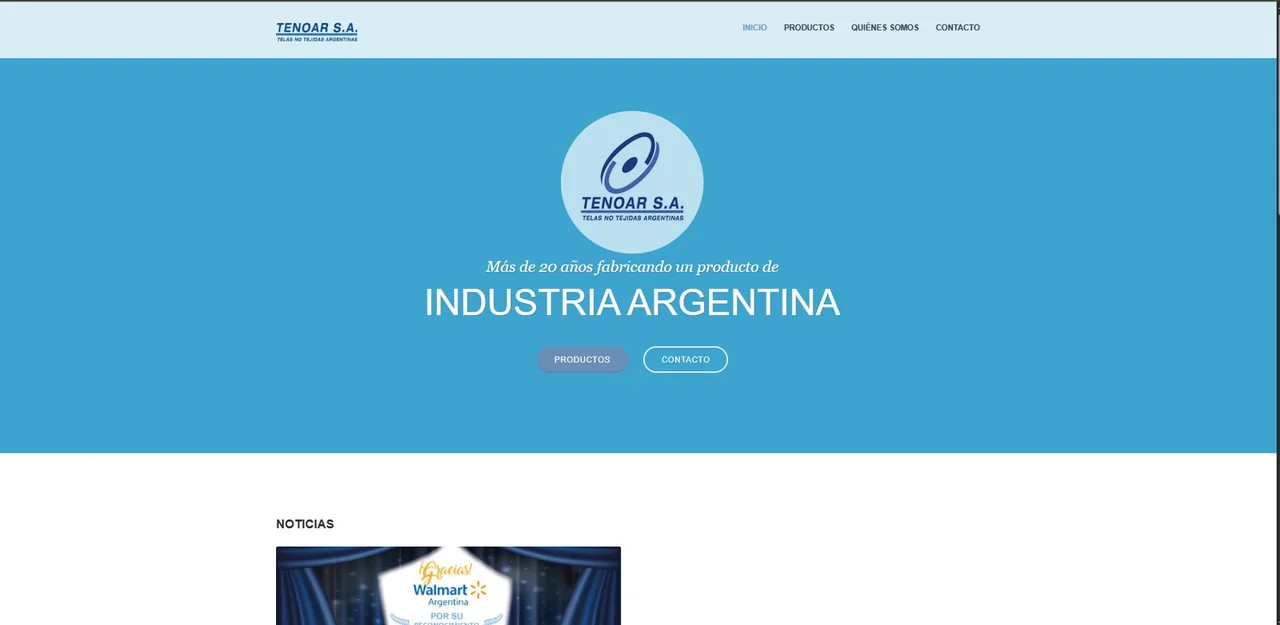
- The hero doesn't explain what Tenoar manufactures or who it serves.
- Products and manufacturing capabilities aren't immediately visible.
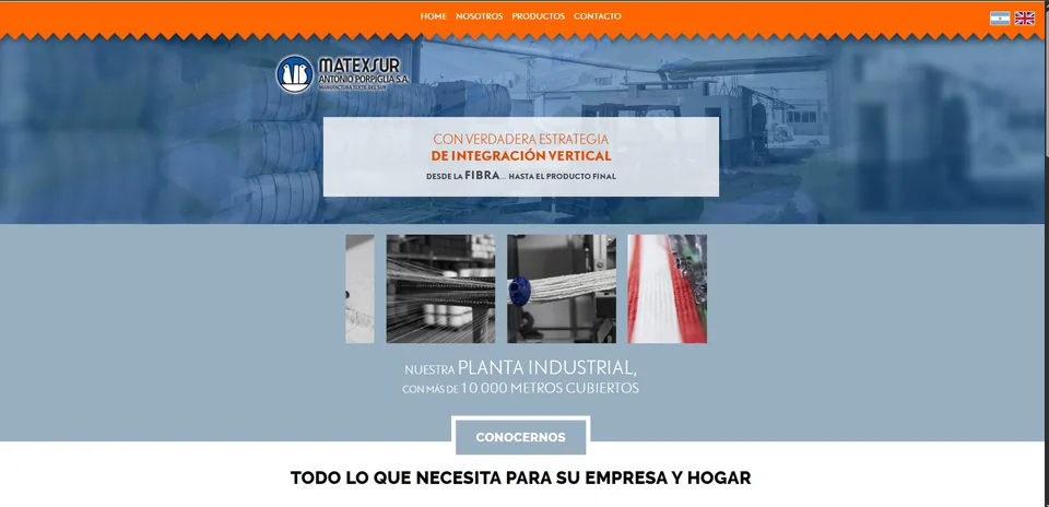
- Industrial scale is visible, but the product offering and target customer aren't clear.
- Vertical integration is mentioned, but its value to customers isn't explained.
03 / Understanding the business
Understanding the industry before designing.
There was no formal user research phase. I used my existing knowledge of the textile business, how the companies manufacture their products, what customers expect when evaluating a textile manufacturer, and a review of comparable brands to decide what the new websites needed to communicate.
Market references
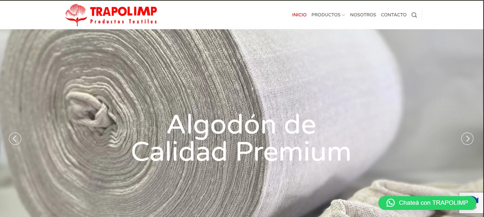 Trapolimp
Strong product visibility, limited information about the company.
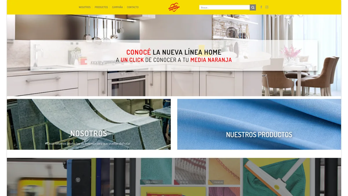 Media Naranja
Clear brand personality, less emphasis on the operation.
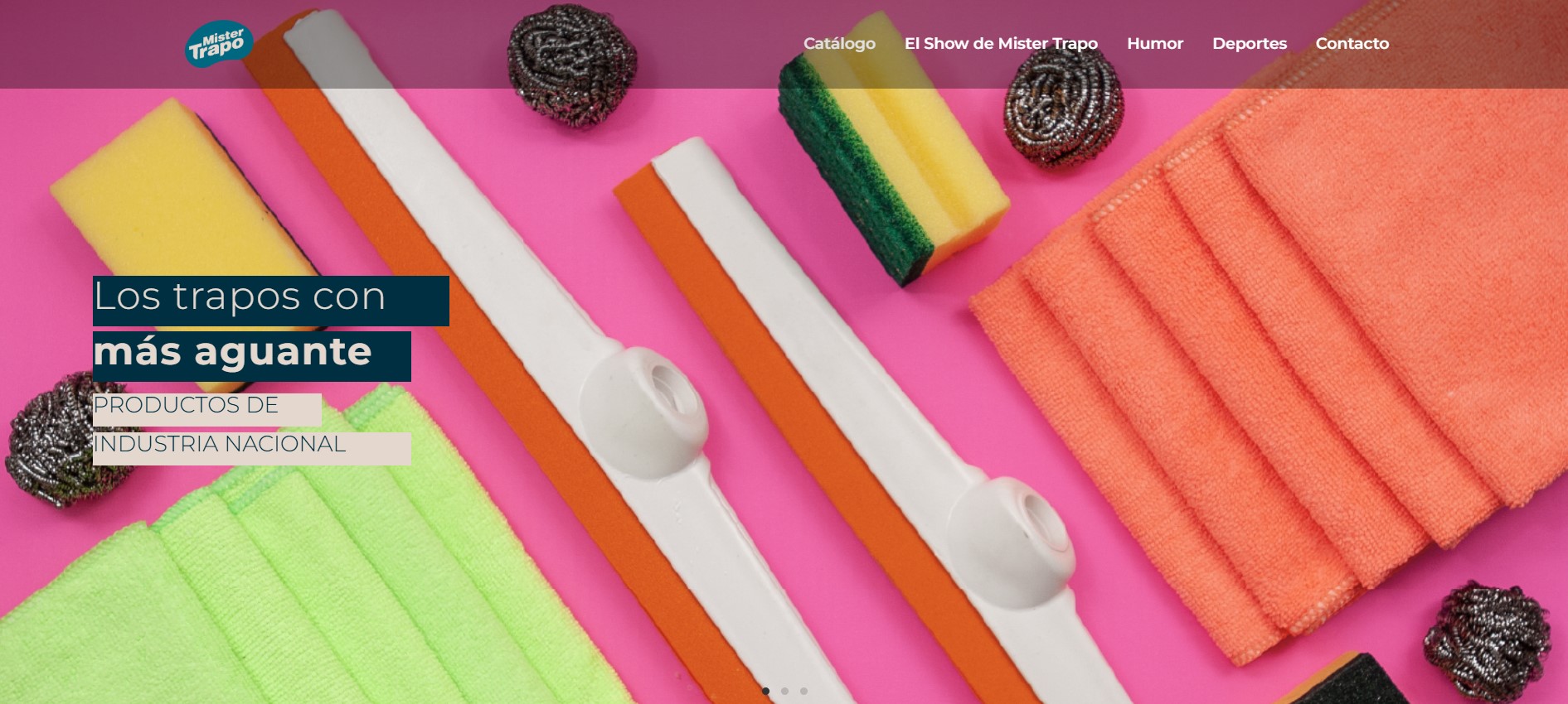 Mister Trapo
Large catalogue, less emphasis on experience and capabilities.
Most of these websites focused on products and catalogues. Fewer gave the same visibility to manufacturing expertise, production scale, private label capabilities or industry experience.
04 / The design decisions
Structure first. Then make each company easier to understand.
What the challenge and the market references showed became five decisions.
- 01Information architecture before visual redesignI reorganised the content first so each page had a clear purpose before working on the visual design.
- 02Industrial credibility over marketing languageThe content focuses on what they manufacture, how they work and the capabilities behind their products.
- 03Content simplificationLong, repetitive descriptions became shorter, clearer sections that are easier to scan.
- 04Navigation restructuringNavigation follows what a potential customer needs first: products, capabilities and company information, then contact.
- 05Two companies, distinct identitiesEach website stays visually distinct while sharing a clearer, more consistent structure.
05 / Final experience
Before and after.
The redesigned websites were launched as public-facing sites for both companies.
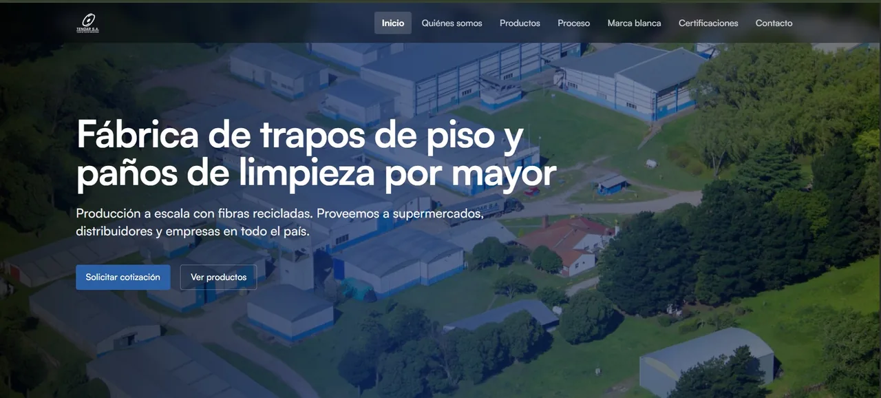
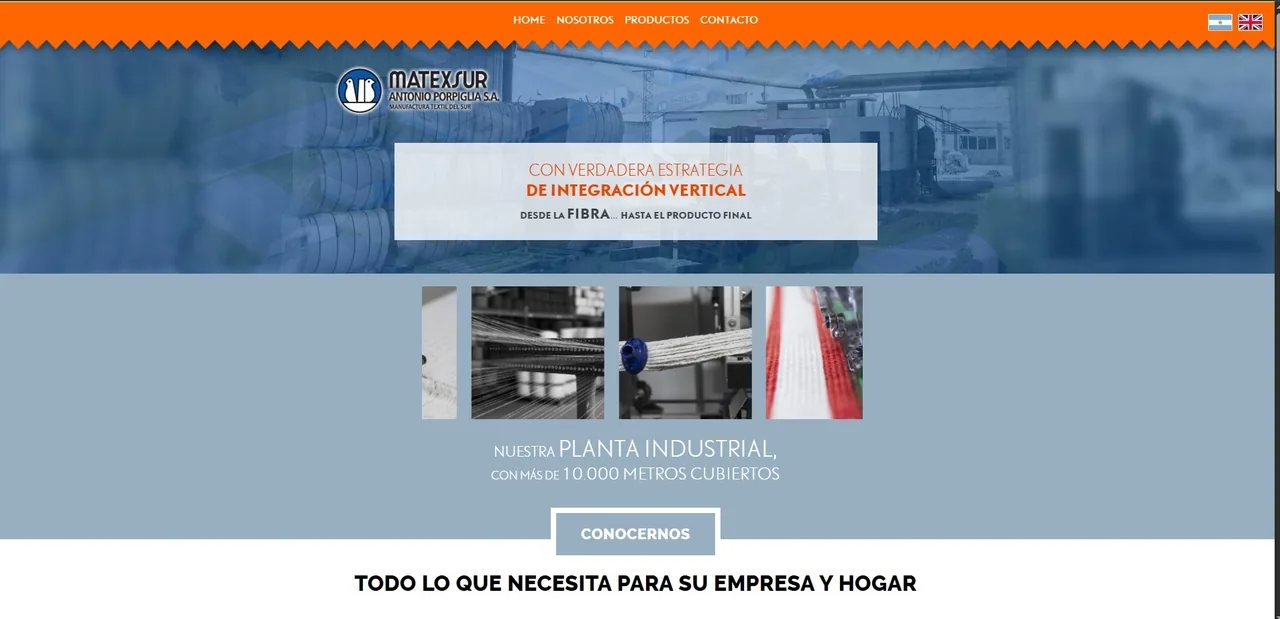
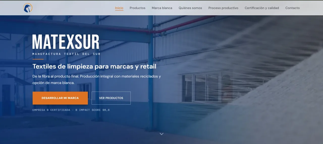
What changed on the websites
- Positioning
- Visitors can understand what each company does and who it serves from the start.
- Credibility
- Manufacturing capabilities, processes and facilities are easier to find.
- Structure
- Information is organised more clearly, with less repetition.
No quantitative business impact was measured.
06 / Reflection
I learned to organize the business before designing the website.
For these websites, making the information easier to find and understand was one of the most important parts of the redesign.
Next, I would look at basic analytics and talk to a few customers to see what works and what could still be improved.
I would keep working on the content: better product descriptions, more real examples and updated photography.
I now spend more time understanding the business and organising the information before starting the visual design.
Information architecture
A new structure around what a B2B buyer needs to evaluate the group: what they make, how they make it, and who is behind the operation.
Previous structure
- Home — About, Company, History
- Products (mixed) — various pages, overlapping topics
- Services — generic descriptions
- News
- Contact
New structure
- Home — clear value proposition
- What we make — product categories, product details
- How we work — manufacturing process, capabilities, certifications
- Who we are — group story, facilities
- Contact — commercial inquiries
Problem → decision
- Complex offerings
- Simplified navigation
- Weak credibility
- Certification visibility
- Poor differentiation
- Manufacturing storytelling
- Generic messaging
- Industry-focused positioning
Visual principles
Professional and trustworthy · Industrial but modern · Products and manufacturing first · Clear and easy to scan · Strong readability · Simple and consistent.
The visual system was kept simple so products, facilities and manufacturing experience could take the lead.
Type and colour
Tenoar
- Deep Blue#123573
- Primary Blue#2B60A6
- Primary Text#1D1D1B
- Light Background#F6F7F9
- White#FFFFFF
Matexsur
- Dark#1F1D1D
- Accent Orange#DC7322
- Brand Blue#08347B
- Secondary Text#5C5556
- Light Background#F3F4F5
- White#FFFFFF
Tenoar
Satoshi
Headings / body
Weights: 400 · 500 · 600
Matexsur
Bebas Neue
Display
DM Sans
Body / reading
DM Mono
Labels
Constraints
- Existing brand identity
- Modernise the websites while keeping each brand recognisable.
- Limited content
- No new photography, so the sites had to make better use of existing material.
- B2B audience
- Communicate clearly to business customers looking for products, capabilities and company information.
- Limited timeline
- Focus first on the content and pages that mattered most.
- Existing website structure
- Simplify years of accumulated content without losing useful information.
Trade-offs
Trade-off 01
- Decision
- Modernise without losing the existing brand.
- What was left out
- A complete rebrand and a more radical visual change.
- Why
- Both companies had an established identity; the redesign shouldn't feel unfamiliar to existing clients.
Trade-off 02
- Decision
- Improve the existing content instead of creating everything from scratch.
- What was left out
- New photography, campaigns and additional marketing content.
- Why
- There was no dedicated content team, so the priority was making existing material clearer.
Trade-off 03
- Decision
- Focus on the pages that mattered most to customers.
- What was left out
- More depth in news, blog and company history.
- Why
- With a limited timeline, the priority was what customers needed most.
Market reference notes
- Trapolimp
- Strong product visibility and simple navigation, but limited information about the company and its manufacturing capabilities.
- Media Naranja
- Clear brand personality and product presentation, but less emphasis on the company and the manufacturing operation behind the products.
- Mister Trapo
- A large product catalogue with clear categories, but less emphasis on the company, its experience and manufacturing capabilities.