Selected work
AWIRE
Real client project · Brand identity · Web design · Energy consulting
AWIRE needed more than a website. It needed a digital presence that matched the expertise behind the business.
- Role
- Brand Identity · Web Design · Information Architecture · Implementation
- Timeline
- ~15 days
- Type
- Real client project
- Industry
- Energy consulting
01 / Overview
From reputation to a clear digital presence.
AWIRE is an independent consultancy focused on energy and infrastructure in Latin America.
The project came to me through a colleague, and I took it from start to finish.
There was no existing website, and the visual identity needed an update. The client already had strong recognition and an established professional network, especially through LinkedIn, but AWIRE needed a clear corporate home: a place to explain what the consultancy does, present its expertise and give potential clients a direct way to get in touch.
The project was completed in roughly two weeks, from visual direction and site structure to implementation and launch.
02 / The challenge
The business had credibility. The digital presence had to catch up.
The challenge was not to create a complex platform. It was to make AWIRE easier to understand and easier to contact.
- No digital home
- AWIRE had no website to clearly explain who they were, what they did or how potential clients could reach them.
- Outdated identity
- The existing visual identity no longer reflected the level of the consultancy and needed a more contemporary, consistent system.
- Clear positioning
- The site had to communicate the consultancy’s role in the energy sector quickly, without making visitors work to understand the business.
- Short timeline
- The project needed to move from direction to launch in roughly 15 days, so priorities had to stay focused on what mattered most.
03 / Understanding the business
Clarity mattered more than complexity.
There was no formal research phase for this project.
The direction came from conversations with the client, the material they provided and the need to translate an established professional reputation into a clear corporate presence.
The site needed to communicate five things quickly:
- Energy expertise
- Make the consultancy’s experience and sector focus visible from the start.
- Latin American focus
- Position AWIRE clearly within the regional energy and infrastructure context.
- Credibility
- Create a professional presence that matched the level of the people behind the business.
- Clear services
- Help visitors understand what AWIRE does without relying on long explanations.
- Direct contact
- Give potential clients a simple path to start a conversation.
04 / The design decisions
Get the structure right first. Then give the brand more presence.
The first version already worked structurally, but client feedback was clear: it felt too safe.
That pushed the second pass beyond simply making the website clear and functional.
- 01Update, don't reinventThe existing identity had useful foundations, so I evolved it into a more consistent visual system instead of starting from zero.
- 02Make the value proposition visible earlyThe opening experience needed to explain what AWIRE is and where it operates without forcing visitors to search for context.
- 03Build a simple corporate pathThe site structure was organised around the information a potential client would need first: who AWIRE is, what it does, where it works, why it matters and how to get in touch.
- 04Add more visual energyAfter the first version, I introduced more colour, motion and stronger UI details to give the site more presence without making it feel less professional.
- 05Keep contact closeThe website was designed as AWIRE's main corporate touchpoint, so reaching the consultancy needed to remain simple throughout the experience.
05 / Final experience
A clearer, more confident digital presence.
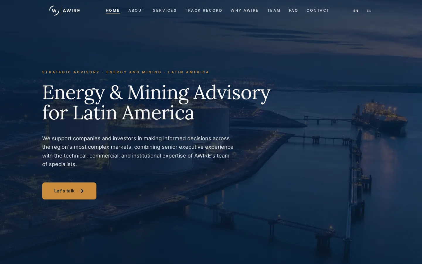
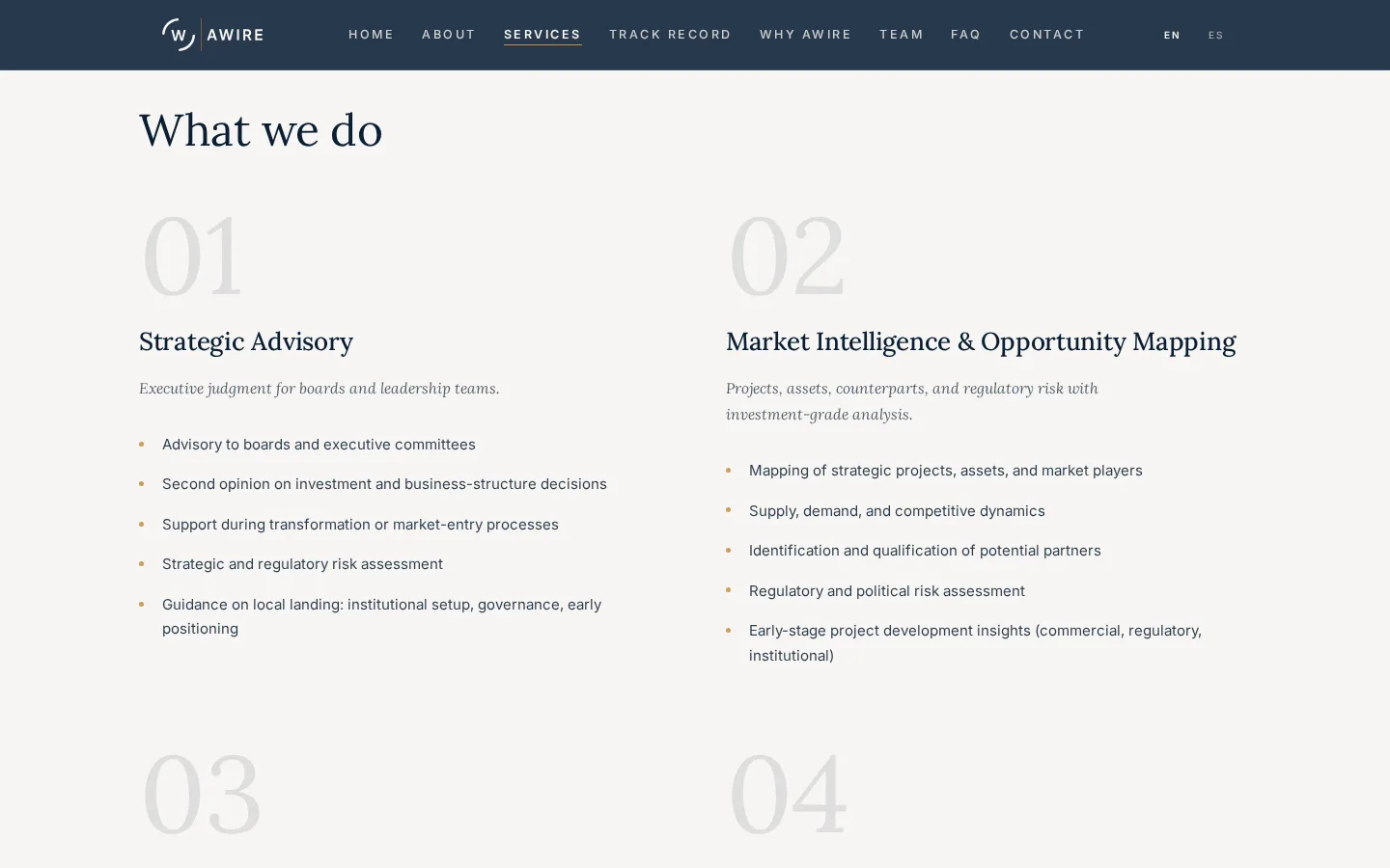
The final website brought AWIRE’s positioning, services, sector focus and contact path into one consistent experience.
The visual identity was updated at the same time, creating a more coherent system across the website and the brand’s digital touchpoints.
What shipped
- Responsive website
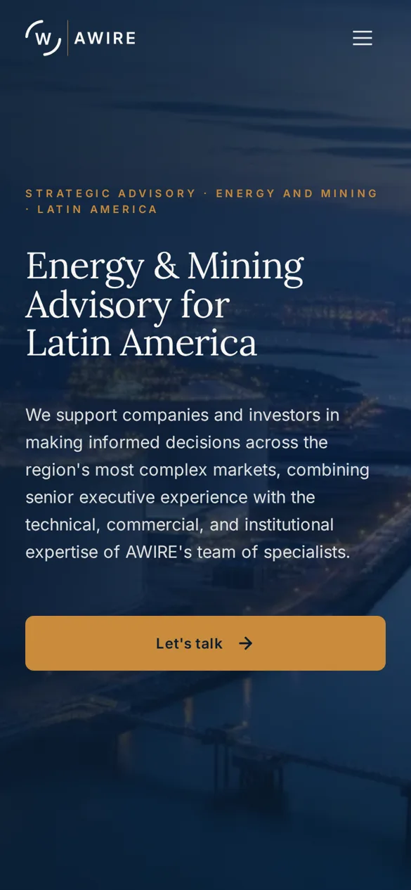
- A custom website built for desktop, tablet and mobile.
- Bilingual experience
- Spanish and English versions were delivered as part of the final site.
- Updated visual identity
- The existing identity was refined into a more consistent system with updated colour, typography and logo usage.
- Clearer site structure
- The site was organised around the information a potential client would need first: what AWIRE does, where it works, its expertise and how to get in touch.
- Contact path
- An operational contact form and clear contact points gave potential clients a direct way to reach the consultancy.
- Technical launch
- The project included domain connection, hosting configuration, HTTPS, initial SEO, metadata, Google Search Console and indexation.
No quantitative business impact was measured.
06 / Reflection
A website can be clear and still feel too safe.
The first version of AWIRE already worked structurally, but the client felt it needed more presence.
That feedback changed the direction of the final pass.
I introduced more colour, motion and stronger UI details while keeping the experience professional and easy to understand.
The short timeline also made prioritisation important. Instead of trying to solve everything, I focused first on the things the website needed to communicate immediately: positioning, credibility and contact.
If I continued the project, I would validate the live site with analytics and real user behaviour rather than relying only on stakeholder feedback.
This project reinforced something I now apply more often: getting the structure right is only part of the job. The visual expression also has to match the confidence of the business behind it.
01 / Visual identity
The existing identity was updated into a clearer and more consistent brand system.

- Off-White#F6F5F2
- Navy Deep#0B1E33
- Navy Mid#0F2238
- Navy Soft#16293D
- Amber#C98B3B
Lora
Display / headlines
Inter
Body / UI
02 / Site architecture
- Home
- Who we are
- What we do
- Sectors
- How we help
- Why AWIRE
- Leadership
- Contact
The structure was kept intentionally direct so visitors could quickly understand the consultancy, its expertise and how to get in touch.
03 / Bilingual experience
The website was delivered in Spanish and English. Both language versions used the same information architecture and interaction patterns, keeping the experience consistent while supporting AWIRE’s international and regional audience.
04 / Responsive implementation
The site was designed and implemented for desktop, tablet and mobile. The layout, typography and navigation were adapted across screen sizes while keeping the hierarchy and content consistent.
05 / Iteration
- First version
- The first version already worked structurally, but the client felt it was too safe.
- Final direction
- More colour, more motion, stronger visual hierarchy and more expressive UI details.
06 / Technical launch
The final delivery included:
- Custom domain connection
- Hosting configuration
- HTTPS
- Contact form
- Initial SEO configuration
- Metadata for search and social sharing
- Google Search Console
- Sitemap
- Google indexation request
- Final QA before launch
07 / Constraints
- Real client project
- The work had to respond to an active client need rather than an open-ended portfolio brief.
- Short timeline
- The project moved from direction to launch in approximately 15 days.
- Client-provided content
- The core website content came from the client, so the design work focused on hierarchy, presentation and structure rather than creating a full content strategy from scratch.
- No formal user research
- There was no dedicated research or usability-testing phase. Direction came from client conversations, provided material and iterative feedback.
- No quantitative results yet
- The website was launched successfully, but no business-performance metrics were available for this case study.